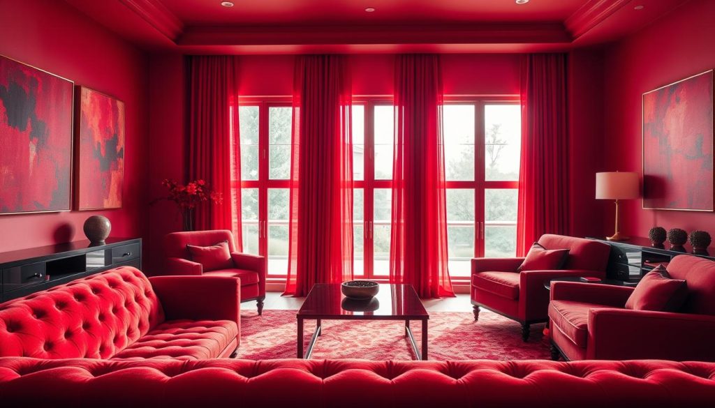
Red transforms spaces with vibrant energy and emotional depth. It unlocks dynamic possibilities for interior design. The right red combinations create dramatic statements or subtle sophistications1.
Complementary colors to red include unexpected neutrals and bold contrasting hues. Designers pair Burnt Sienna with Pine, Crimson with Saffron, and Raspberry Sorbet with Burnt Sienna1. These pairings let red shine while keeping visual harmony2.
Small red accents can dramatically change a space without overwhelming it. Strategic placement of red elements creates visual interest and emotional impact2. Red offers versatile design opportunities through artwork, furniture, or decorative accessories.
Key Takeaways
- Red is a versatile color with powerful design potential
- Complementary colors can enhance or soften red’s intensity
- Small red accents can create significant visual impact
- Color pairings range from traditional to contemporary styles
- Careful color selection prevents design overstimulation
Understanding Red in Interior Design
Red transforms spaces with its bold presence. It’s a powerful color that impacts home decor psychologically. Using red in design needs careful planning and color knowledge34.
The Psychology of Red in Home Decor
Red stirs strong emotions, boosting energy in living spaces. Designers use red to create specific moods5.
The color can increase room energy and spark conversation. It also creates warmth and draws visual attention.
- Increase room energy
- Stimulate conversation
- Create a sense of warmth
- Attract visual attention
How Red Affects Room Atmosphere
Red schemes can change room dynamics dramatically. Most designers suggest using red as an accent color5.
This prevents overwhelming smaller spaces. Red’s intensity requires careful application to keep balance3.
Light Considerations When Using Red
Lighting greatly affects how red looks. Red works best in rooms with ample light5.
Here are some lighting strategies to consider:
- Use red in well-lit spaces
- Choose softer red shades for rooms with limited light
- Incorporate neutral tones to balance red’s intensity
| Room Type | Red Usage Recommendation | Lighting Consideration |
|---|---|---|
| Living Room | Accent walls | Natural light preferred |
| Bedroom | Subtle red accessories | Soft, warm lighting |
| Kitchen | Red elements with white | Bright, clear lighting |
Classic Colors that Go with Red
Red is a powerful color that demands attention in design. Choosing complementary shades carefully is crucial. Understanding how different hues interact creates specific moods in living spaces.
Neutral colors offer versatile ways to incorporate red. White, black, and gray provide elegant backdrops for red to shine. Explore these classic red and neutral color combinations for sophisticated interiors.
- White: Creates a crisp, clean look
- Black: Offers dramatic contrast
- Gray: Provides a calming balance
- Beige: Adds warmth and softness
Blue shades pair remarkably with red. From cobalt to navy, blue creates stunning visual harmony. Red and blue combinations can be bold and energetic or refined and elegant.
Pro Tip: When using red, consider the room’s natural light and intensity to achieve the perfect balance.
Unexpected color pairings like mint green or turquoise can deliver remarkable results. These combinations showcase red’s incredible versatility in interior design67.
Modern and Trending Red Color Combinations
Bold red color combinations are reshaping interior design. Designers are exploring unexpected red color combinations that energize spaces. Red is now a dynamic accent color in urban apartments and minimalist homes.
Innovative red color schemes break design norms with surprising pairings. Lavender + Turquoise + Red combinations scored an 80% boldness rating. Periwinkle, mint green, and turquoise create striking contrasts with red8.
Personalized spaces inspire creative red color schemes. Periwinkle + Orange-Red combinations have a 65% satisfaction rate among homeowners. Vibrant color palettes are replacing minimalist approaches in interior design9.
Red is now a powerful design element. It energizes and transforms living spaces. Contemporary design celebrates red’s versatility in various settings10.
Amethyst + Red combinations show a 75% style impact in urban apartments. Living rooms now feature bold red pairings. Designers encourage homeowners to be adventurous with red color combinations98.
FAQ
What are the best neutral colors to pair with red?
White, black, gray, and beige work well with red. These colors balance red’s intensity and create versatile design schemes. White makes red pop, while gray and beige offer a soft backdrop.
How does red affect the mood of a room?
Red is a powerful color that impacts a room’s atmosphere. It can boost appetite in dining areas and create warmth in living spaces. Red also evokes passion and energy in bedrooms or home offices.
What are some unexpected color combinations with red?
Mint green, turquoise, and periwinkle pair well with red. These combos create striking, modern interiors that break traditional color rules. Mint green offers fresh contrast, while turquoise provides a vibrant complementary look.
How should I consider lighting when using red in my home?
Lighting affects how red appears in a space. Natural light softens red’s intensity, while warm artificial lighting enhances its richness. Cool LED lights might make red look harsh. Test red in different lighting before finalizing your room design.
Can red work in minimalist or Scandinavian-inspired spaces?
Yes, red works great in minimalist designs as an accent color. Use it sparingly through throw pillows, artwork, or a statement furniture piece. In Scandinavian spaces, deep or muted red adds warmth to the neutral palette.
What are the most classic color combinations with red?
Classic color combinations with red include blue, white, and various neutral tones. Red and blue can range from nautical navy to softer, muted blue tones. These timeless combos work well in traditional and contemporary interior designs.
How can I use red without making a room feel overwhelming?
Use red strategically as an accent color to prevent it from overwhelming a room. Follow the 60-30-10 design rule: 60% neutral colors, 30% secondary colors, and 10% accent colors. This approach lets red add drama without dominating the space.
Source Links
- These 20 Rooms Use a Red Color Palette in All the Right Ways – https://www.elledecor.com/design-decorate/color/g43564492/what-colors-go-with-red/
- The Best Colors to Pair with Red, According to Designer Annie Sloan – https://www.veranda.com/decorating-ideas/g41003120/colors-that-go-with-red/
- How to use a color wheel for interior design – https://www.homesandgardens.com/spaces/decorating/color-wheel-223700
- What Colors Go With Red | Things You Should Know – https://www.architecturelab.net/what-colors-go-with-red/
- 20+ Colors that Go with Red at Home Decor – Color Psychology – https://www.colorpsychology.org/blog/colors-that-go-with-red/
- 41 Colors That Go With Red (Color Palettes) – https://www.color-meanings.com/colors-that-go-with-red/
- What Colors Go with Red? 21 Knockout Combinations to Consider – https://www.bhg.com/decorating/color/schemes/what-colors-go-with-red/
- What Colors Go With Red? 10 Colors That Hold Their Own Alongside This Fiery Hue – https://www.livingetc.com/ideas/colors-that-go-with-red
- 27 Rooms That Will Convince You to Decorate With Red – https://www.housebeautiful.com/design-inspiration/g25895876/colors-that-go-with-red/
- 10 Vibrant Red Color Combinations and Photos – https://www.shutterfly.com/ideas/red-color-combinations/