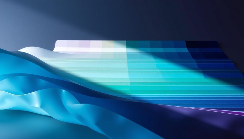
Color psychology reveals fascinating insights about visual appeal and perception. Color temperature affects how we experience different hues. The coolest color isn’t just personal preference – it’s rooted in scientific principles1.
Cyan is the ultimate cool color, at 180 degrees on the color wheel1. This position makes it the quintessential representation of coolness in color theory. Cyan embodies a serene essence that captivates designers and artists2.
Colors can evoke emotions, influence perceptions, and create specific atmospheres. Cool colors like blue, green, and purple are effective in creating tranquil environments2.
Key Takeaways
- Cyan is scientifically considered the coolest color
- Color temperature impacts emotional and psychological responses
- Cool colors create calming visual experiences
- Color positioning on the wheel determines temperature perception
- Design and art leverage color temperature for specific effects
Understanding Color Temperature in Visual Design
Color temperature bridges science and perception, showing how vibrant hues interact with our visual understanding. Designers use color trends to create powerful emotional experiences. Strategic color perception helps artists craft impactful visuals.
The Kelvin scale measures how we experience different light and color spectrums. Color temperature ranges from warm to cool. This range influences our psychological and emotional responses.
Scientific Foundations of Color Perception
Color temperature varies across different light sources:
- Candlelight: Warm at 1500K3
- Sunrise/Sunset: Around 3200K3
- Natural Daylight: Approximately 5500K3
- Blue Sky: Reaching 12000K3
Physical and Psychological Temperature Dynamics
Color temperature perception goes beyond scientific measurement. Higher Kelvin values create cooler, more tranquil atmospheres. Lower values generate warmer, optimistic feelings.
Color Temperature Measurement Insights
| Industry | Color Temperature (K) | Typical Use |
|---|---|---|
| Photography | 6500 (D65) | Digital Design |
| 5000 (D50) | Print Media | |
| Cinematography | 6300 (D63) | Video Production |
Color temperature knowledge helps pros create visually consistent designs. This understanding allows for emotionally resonant creations across various media platforms.
Why Cyan is the Coolest Color: Temperature and Perception
Cyan shines as the ultimate cool color. It blends color symbolism and visual perception beautifully4. This unique hue offers designers a powerful tool for creating spatial and emotional effects in color temperature5.
Cool colors like cyan can make rooms seem bigger. This property is useful in many fields. Designers use it to create open spaces and convey calm environments5.
- Interior design: Creating illusions of openness
- Branding: Conveying calm and professional environments
- Marketing: Establishing trust and clarity
Cyan’s unique position on the color scale makes it the coolest color. It sits at about 180 degrees on the spectrum4. Cyan has several positive effects on our minds.
- Promoting mental clarity
- Reducing stress
- Enhancing focus and productivity
Cyan’s meaning varies across cultures. Yet, it universally brings feelings of calm and style. This remarkable color shapes our visual and emotional experiences everywhere5.
Conclusion
Color harmony profoundly impacts human perception and emotions. The coolest color requires deep exploration of color psychology and design principles6. Strategic color selection can transform visual communication and brand experiences7.
Cool colors like blue and green have unique psychological properties. They influence perceptions of time, mood, and cognitive responses6. The world of color theory offers endless creative possibilities8.
Color harmony’s significance is clear in color interactions. Professionals can benefit from understanding how cool colors communicate powerful messages7. Experimenting with color temperature opens doors to innovative visual storytelling6.
New technologies and cultural shifts reshape our understanding of color perception. By using cool colors, we can create more meaningful and impactful visual communications8.
FAQ
What exactly is a cool color?
Cool colors are found on the blue side of the spectrum. They include cyan, blue, green, and purple. These hues create a sense of calm and serenity.
Cool colors often remind us of water and sky. They bring a feeling of tranquility to any space.
Why is cyan considered the coolest color?
Cyan is scientifically the coolest color due to its unique spectrum position. It closely matches our visual perception of coolness. Cyan often evokes feelings of calmness and clarity.
How do cool colors affect mood and perception?
Cool colors have a strong psychological impact. They typically induce feelings of calmness and relaxation. These hues can lower perceived temperature and create a sense of spaciousness.
In design, cool colors often represent professionalism and trust. They’re also used to convey technological innovation.
Are color temperatures scientifically measurable?
Yes, color temperature is measured on the Kelvin scale. It ranges from warm (lower values) to cool (higher values). However, perception of color temperature can vary based on cultural and personal factors.
How do cool colors differ across cultures?
Cultural perceptions of cool colors can vary significantly. Western cultures often link cyan and blue with calmness and professionalism. In some Asian cultures, certain blue and green shades represent prosperity or healing.
Can cool colors be used effectively in branding?
Absolutely! Many tech companies use cool colors to show reliability and innovation. Organizations like IBM, Facebook, and LinkedIn use cool blue tones strategically. These colors help create a sense of credibility and technological advancement.
Do cool colors have any physical effects?
Research suggests cool colors can impact us physically. They may lower heart rate and reduce blood pressure. Cool colors can also create a sense of visual cooling.
In interior design, these hues make spaces feel larger and more open.
How can I incorporate cool colors in my personal or professional projects?
First, think about the mood you want to create. Use cyan, blue, and green tones strategically in your designs. Consider the context – cool colors work well in tech interfaces and healthcare settings.
These colors are great for spaces that need calm and focus.
Source Links
- The Temperature Of Color – Warm Or Cool ? – John Paul Caponigro – https://www.johnpaulcaponigro.com/blog/18479/warm-cool-temperature-color/
- How to Use Warm and Cool Colors With Your Home Decor – https://www.thespruce.com/understanding-warm-and-cool-colors-1976480
- What is Color Temperature & Why It’s Important in Photo & Film – https://www.studiobinder.com/blog/what-is-color-temperature-definition/
- Defining Warm and Cool Colors: It’s All Relative | Just Paint – https://justpaint.org/defining-warm-and-cool-colors-its-all-relative/
- The Science of Color Temperature: How it Affects Mood and Ambiance | VONN Lighting – https://www.vonn.com/blogs/articles/the-science-of-color-temperature-how-it-affects-mood-and-ambiance?srsltid=AfmBOoqntyiEnpBTk-TM3zbM1sIdISQzhC65Q5KSAg1ezDN8JQUaEflk
- Color psychology – https://en.wikipedia.org/wiki/Color_psychology
- The Ultimate Guide to Color Psychology in Marketing with Examples – https://instapage.com/blog/ultimate-guide-to-color-psychology/
- Color Theory 101 – J.George Version – https://www.sitepoint.com/color-theory-101-2/