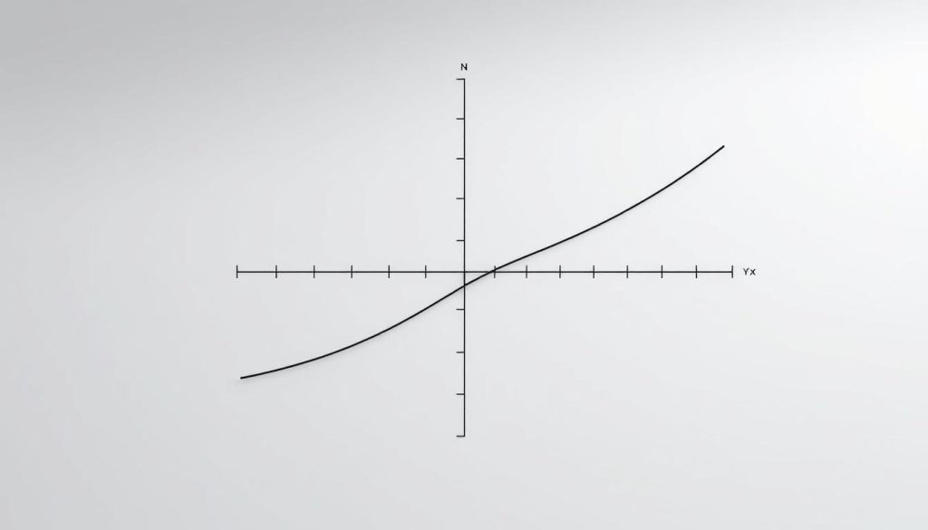
Graphs play a key role in showing data clearly. In science, graphs have a specific layout. The x-axis (horizontal line) shows the independent variable. The y-axis (vertical line) displays the dependent variable1.
Researchers use a set method for “vs” graph axis placement. They put the factor they control on the x-axis. This independent variable affects the outcome1.
Let’s look at a real example. For student performance, study hours go on the x-axis. Test scores appear on the y-axis1.
This method helps scientists share complex data visually. It makes relationships easier to understand through graphs.
Key Takeaways
- Independent variables are plotted on the x-axis
- Dependent variables are positioned on the y-axis
- Proper graph layout enhances data comprehension
- Variables follow a consistent mapping pattern
- Visual representation simplifies complex data relationships
Understanding Independent and Dependent Variables in Graphing
Data visualization turns complex numbers into clear graphs. It helps researchers see how variables relate to each other2. In scientific plotting, independent and dependent variables are key players3.
Defining Independent Variables in Data Visualization
An independent variable is what researchers control in an experiment4. It usually appears on the horizontal axis (x-axis) in charts2.
Examples of independent variables include:
The Role of Dependent Variables in Graph Construction
Dependent variables show the outcomes measured in an experiment3. They’re typically on the vertical axis (y-axis). These variables reveal how changes in the independent variable affect results2.
| Variable Type | Characteristics |
|---|---|
| Independent Variable | Manipulated or controlled factor |
| Dependent Variable | Measured outcome responding to changes |
Key Relationships Between Variables in Scientific Plotting
Visual analytics show how independent and dependent variables interact4. Researchers use different graph types to show these relationships.
- Line graphs for time-series data3
- Bar charts for categorical comparisons4
- Scatter plots for quantitative analysis4
Knowing axis orientation and variable relationships is vital. It helps accurately interpret data in scientific research2.
“vs” Graph Axis Placement: Rules and Best Practices
Creating effective plots requires strategic thinking about data display. For comparative displays, axis placement is crucial for clear visual communication5. Contrastive graphics need precise variable selection and thoughtful construction. Graph design principles can guide researchers in this process5.
The horizontal axis typically shows the independent variable. The vertical axis displays the dependent variable. This standard approach helps viewers understand data relationships quickly6.
In a position-time graph, the slope correlates with velocity. A constant slope indicates steady movement6. Steeper slopes suggest faster motion, whether forward or backward6.
Graph selection is vital in data visualization. Key tips include avoiding crowded lines and using direct labeling. Choosing suitable color schemes is also important5.
When plotting motion data, curved lines can show acceleration. This provides deeper insights into the underlying dynamics6. Scientists must consider these nuances for accurate visual representations.
Effective graph creation blends art and science. Following best practices for axis placement and data visualization is crucial. This helps transform complex info into clear graphics5.
FAQ
What is an independent variable in a graph?
An independent variable is a factor you control in an experiment. It’s usually on the x-axis of a graph. This variable represents the input or cause in a study.
Researchers change it to see how it affects the dependent variable. It’s the starting point for understanding cause and effect relationships.
How do I identify the dependent variable in my graph?
The dependent variable shows the outcome of changes to the independent variable. It’s typically on the y-axis and measures the effect in an experiment.
In a plant growth study, the plant’s height would be the dependent variable. It changes based on different watering conditions.
What are the key relationships between independent and dependent variables?
Variables can have linear or non-linear relationships. Linear relationships show proportional changes between variables. Non-linear relationships have more complex patterns.
Positive correlations mean both variables increase together. Negative correlations show one variable increasing as the other decreases.
How do I choose the right type of graph for my data?
Your graph choice depends on your data type and research question. Scatter plots show relationships between two continuous variables.
Line graphs display changes over time. Bar charts compare discrete categories. Histograms show the distribution of numerical data.
What are common mistakes to avoid when creating graphs?
Avoid inconsistent axis scales and cluttered labeling. Don’t use 3D graphics that distort data representation.
Choose appropriate graph types for your data. Include clear titles and legends. Avoid overcrowding the graph with too much information.
What are the standard conventions for axis placement?
Usually, the independent variable goes on the x-axis. The dependent variable is on the y-axis.
Some exceptions exist based on research contexts or field conventions. Always label your axes clearly to show what they represent.
How important are graph design elements like color and font?
Graph design elements are crucial for clarity. Use high-contrast, color-blind friendly colors and clear, legible fonts.
Stick to consistent color schemes and appropriate font sizes. Minimize unnecessary decorative elements. These choices help viewers interpret your data accurately.
Source Links
- Graphing primer – https://mathbench.umd.edu/modules/visualization_graph/page02.htm
- Step by Step Solution – https://www.vaia.com/en-us/textbooks/physics/mathematics-for-engineers-4-edition/chapter-6/problem-1-explain-the-meaning-of-the-terms-dependent-variabl/
- Dependent and Independent Variable – GeeksforGeeks – https://www.geeksforgeeks.org/dependent-and-independent-variable/
- Independent vs Dependent Variables | Definition & Examples – https://www.scribbr.co.uk/research-methods/independent-vs-dependent-variables/
- 2.4 Velocity vs. Time Graphs – Physics | OpenStax – https://openstax.org/books/physics/pages/2-4-velocity-vs-time-graphs
- Position-Time Graphs: Meaning of Shape – https://www.physicsclassroom.com/class/1DKin/Lesson-3/The-Meaning-of-Shape-for-a-p-t-Graph